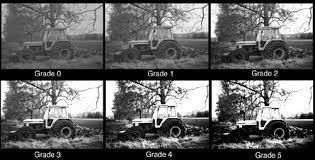
At their most basic, paper grades could hardly be easier to understand or to master.
Paper grades range from 00 (very soft) to 5 (very hard).
Make a print on a middling grade of paper (2 or 3); develop it to completion; dry it; and look at it.
If it looks flat and muddy, you need a harder paper grade (3-4-5).
If it looks too harsh and contrasty — what used to be called ‘soot and whitewash’ — you need a softer paper grade (2-1-0-00).
Repeat until it looks right. Remember, you don’t have to expose a whole sheet of paper: a small test strip can tell you a good deal.
development to completion
Development to completion is important. If you ‘snatch’ the print before it is fully developed, you will never get the full contrast range of which the paper is capable. Nor will you get repeatable results. If the print is darkening too fast, you have over-exposed it. Throw it away and start again with a shorter exposure or a smaller aperture or both. Once again, you don’t have to expose a whole sheet of paper: a small test strip can tell you a good deal.
Modern papers are almost all designed to be developed to completion, that is, until the blacks are as deep as they are ever going to get and the contrast is as high as it will ever be. The paper or developer instructions should tell you this development time, but it is usually 2 to 3 minutes at 20 degrees C, 68 degrees F. You can reduce it by working at higher temperatures, typically 24 degrees C, 75 degrees F.
dry-down
As it dries, a print loses contrast and gains density: this is called dry-down. Typically, if you want your dry print to match the contrast of your wet print, you should give about 10 per cent less exposure and use paper about 1/2 grade harder. These are very rough figures and vary widely from paper to paper. The only way to learn how much dry-down your preferred paper gives in your preferred developer is to try it. Once you know about the phenomenon, though, it is much easier to make allowance for it. If you dry your test strip before evaluating it, of course, you can judge what changes to contrast and exposure you may need.
exposure and contrast
Everything we have said so far assumes, of course, that there is a full range of tones from pure white to the deepest black of which the paper is capable. The brightest highlights and deepest shadows may be tiny, but if they should be there and they are not, you may also have got the exposure wrong.
If there are no deep blacks, you have under-exposed.
If there are no pure white highlights, you have over-exposed.
In either case, re-make the print with a different exposure. Then go back to the opening paragraph of this module.
graded paper and variable-contrast paper
Originally, paper was sold in discrete grades. Sometimes these had names, and sometimes they were assigned numbers, as noted above.
In the late 1930s Ilford devised an ingenious system for providing a wide range of grades in a single paper, by changing the colour of the light used to make the print. They called it “Multigrade” which is an Ilford trade name. The generic term is variable contrast or VC.
In the current version, to simplify matters somewhat, there is a soft (low contrast) emulsion that is sensitive to green light and a hard (high contrast) emulsion that is sensitive to blue light. In reality, there are more than two emulsions, but this does not affect the theoretical basis.
Without any filtration, the paper corresponds roughtly to a grade 2 graded paper. Filter out the green light (with a magenta filter) and the hard emulsion comes to the fore: contrast goes up. Filter out the blue light (with a yellow filter) and the soft emulsion comes to the fore: contrast goes down.
By providing a series of graded filters it is possible to re-create not only the full grades of graded paper but even half-grades. Indeed, by making part of the exposure through one filter and part through another, you can create still finer fractional grades: half through 3 and half through 3-1/2 creates 3-1/4. Another possibility is to use dial-in grades on a dedicated VC enlarger head, or the yellow and magenta filtration on a colour head. Both discrete filters and VC heads have the advantage that exposure remains constant (except perhaps for hard grades, see below): with a colour head, some adjustment of exposure is likely to be necessary as you change grades. See also the free module on split-grade printing.
Because of the onset of World War Two, variable-contrast paper (Varigam) appeared first on the American market (where Ilford did not sell). For decades they were markedly inferior to graded paper, but some time in the 1980s they caught up and today many fine printers are as every bit as happy with VC as with graded. There are however a few papers that are available only in graded form and some printers reckon that these give them results they cannot achieve any other way. Some of them are probably right, but others are of that school which believes that the more difficult something is, the better it must be.
the relevance of developers
Some paper developers deliver more contrast than others. Very roughly, compared with a middle-of-the-road developer, you can gain up to 1/2 grade or lose up to one full grade. This holds good for both graded and VC papers.
Years ago, some people used this as a means of getting intermediate grades. Some would use two baths, one hard, one soft, developing the paper in one or the other, or partly in one and partly in the other.
This was more effective in the days when paper was not developed to completion, but at least one manufacturer still sells high-contrast and low-contrast paper developers (Tetenal ??? and ???). Today, however, VC papers are generally reckoned to be an easier, better solution.
paper speed
Papers have ISO speeds, the same as films, but as enlarging exposure meters are never graduated in paper speeds and as it is so easy to make a test strip, no-one pays much attention to them. It is, however, worth knowing four things. First, ISO paper speeds and ISO film speeds are not determined in the same way and are not comparable. Second, if you want to expose papers in camera using ISO film speeds, start out at around ISO 2. Third, warm-tone papers are usually about half as fast as normal-tone, i.e. they require about a stop of extra exposure. Fourth, hard grades of paper are usually slower than soft ones. This is true for both graded and VC papers. Typically, grades 00 to 3 or 4 are much the same speed, and grade 5 (and occasionally 4) is about half as fast.
understanding more
After a while, if you really care about printing, you start looking for a pattern in which negatives suit which paper grades — and it is not difficult to find one.
Printing is a three-cornered process. The first corner is the brightness range of the subject. The second is the contrast of the negative. And the third is the paper grade.
A ‘normal’ subject, developed for a ‘normal’ time, should print on a ‘normal’ grade of paper: typically grade 2, 2-1/2 or 3 depending on your personal preference.
personalizing development times
The majority of your negatives on ‘average’ subjects should print on your preferred paper grade. If they do not, the remedy is simple.
If you consistently need soft paper grades (2-1-0-00) more often than hard (3-4-5) your negatives are overdeveloped.
If you consistently need hard grades (3-4-5) more often than soft (2-1-0-00) your negatives are underdeveloped.
Change development times in either 30 second steps (development times under about 10 minutes) or 1 minute steps (development times over about 10 minutes). After two or three films you should have arrived at a personalized development time that allows the majority of your negatives to print on grades 2 to 3.
subject brightness range, negative contrast and paper grade
If the subject brightness range is unusually long or unusually short, and you do not change the development time, then a straight print on a ‘normal’ grade of paper may look unusually flat and dull or unusually contrasty. The easiest answer to this is to use a higher contrast grade (3, 4, 5) to gain contrast or a lower contrast grade (2, 1, 0, 00) to lose contrast.
Another possibility is to change the film development time. More development means more contrast; less development means less contrast. For a subject with a short brightness range, increase your development time so as to get a negative with more contrast. For a subject with a long brightness range, decrease your film development time to get a negative with less contrast.
There are many ways to determine how much you need to increase or decrease development time. The Zone System purports to tell you how to make every negative fit onto grade 2 paper, by carefully matching development time (and hence negative contrast) to subject brightness range. This is too much trouble for most people and in any case is feasible only if each negative is developed individually or if negatives of identical brightness range are grouped together on one film. For this and other reasons there is a free module in which we explain why we do not advocate the Zone System.
15/50
We recommend a much simpler approach. For a whole roll of unusually contrast subjects, cut the development time by 15 per cent. For a whole roll of unusually flat subjects (subjects with a very short brightness range), increase the development time by 50 per cent. Use different paper grades to make the fine adjustments.
There is nothing sacred about 15/50. Others cut development by as much as 20 per cent or as little as 10 percent; in the other direction, you may prefer to increase development only by 30 or 40 per cent. But a total of three development regimes — one short, one normal, one long — should suffice for the vast majority of subjects when used in association with different paper grades.
over- and under-developed negatives
An over-developed negative is too contrasty and therefore requires a soft grade of paper. An under-developed negative is ‘flat’ or soft and therefore requires a harder grade. In fact, paper grades were originally devised to take care of wrongly developed and poorly exposed negatives. The original ‘normal’ grade was soon supplemented by ‘vigorous’ grade (for flat negatives) and ‘soft’ grade (for contrasty or indeed ‘vigorous’) negatives. Later came ‘extra vigorous’ and ‘extra soft’. Today, most manufacturers use grade numbers instead of names.
the numbers
One problem with contrast grades is that different manufacturers’ numbers do not agree: what one reckons is a grade 2 will be another’s grade 3. Also, papers have become harder over the years: a grade 2 may well be harder today than 30 years ago.
To get around this, sensitometrists use ISO(R) numbers. A lower ISO(R) number is a higher contrast; a higher ISO(R) number is a lower contrast. Very roughly, the following ISO(R) numbers correspond to grades as given:
ISO(R) | Paper Grade | Notes |
35-50 | 5 | Very hard |
50-70 | 4 | The equivalent of the old “vigorous” |
70-90 | 3 | Hard normal |
90-110 | 2 | Soft normal |
110-130 | 1 | Soft |
130-160 | 0 | Very soft; may or may not be available as graded paper |
160+ | 00 | Normally available only as a VC paper grade |
An ISO(R) number is the log exposure range (see the free module on logs and densities) that is required to give a full density range on a given paper grade. Thus for example ISO(R) 60 corresponds to a log density range of 0.60 or 2 stops or 1:4 while ISO(R) 150 is a log density range of 1.50 or 5 stops or 1:32.
maximum hardness
Graded paper is normally hardest. With VC papers, discrete filters normally give maximum contrast, followed by VC heads, then colour heads. Contrary to popular belief, grade 5 graded paper will not lose contrast over the years so it is worth keeping a box of grade 5 graded for extreme negatives — though of course, image colour is unlikely to match.
print brightness range
The darkest black on a top quality glossy print reflects about 1/200 as much light as the brightest paper-base white. In other words, the maximum brightness range is 200:1. This can also be expressed as a log density range (free module) of 2.3 or a range of about 7-2/3 stops. In practice, many papers cannot even reach this density range: maximum log density ranges of 2.1 or less (128:1, 7 stops) are commonplace.
print dynamic range
What is more, there is a difference between the maximum possible range and the so-called dynamic range within which you can distinguish texture and detail. You are doing pretty well if this is as much as a log density range of 2.0, which is a brightness range of 100:1 or 6-2/3 stops. Older books refer to dynamic ranges of 64:1 (6 stops, log range 1.8) or even 50:1 (5-2/3 stops, log range 1.7).
subject brightness range
Subject brightness ranges, of course, can vary enormously. On a misty day they may well be below as 1:4 (log density range 0.6, 2 stops) while with something like a church interior the brightest part of the scene could easily be 1000 times brighter than the darkest part: log density range 3.0, or 10 stops. Read the free module on subject brightness range and the free module on log density ranges if you need a refresher course.
matching subject brightness to print brightness
Begin with an ‘average’ subject brightness range of 128:1. This is a log brightness range of 2.1 (actually a log brightness range of 2.1 is a range of 125:1 but the approximation is plenty good enough).
Now postulate a flare factor (see glossary) of 1.5x: a fairly realistic figure with many good miniature or roll-film cameras fitted with prime lenses. The logarithm of 1.5 is 0.18. The image brightness range at the film is therefore 2.1 – 0.18 = 1.92.
Develop the film to an ISO standard gamma (see the free module on density) of 0.62. The subject brightness range is now reduced to a negative density range of 1.92 x 0.62 = 1.19.
Postulate a flare factor for the enlarger of 2 (log = 0.3, a completely believable value). The projected image brightness range at the paper is therefore 1.19 – 0.3 = 0.89. To produce a full density range on the print, you therefore need an ISO(R) of near enough 90 — which is the typical value of a modern grade 2!
Of course you can insert all sort of different figures. With a view camera having well-blacked bellows, and using a modern, multi-coated lens, the flare factor may be as near 1 as makes no odds. In other words, the image brightness range at the film is the same as the subject brightness range, a log range of 2.1. With the same enlarger and the same paper grade you will need a gamma of 1.19/2.1 = 0.57 to give the same projected image brightness at the paper surface.
In practice, flare levels are so variable, and so is the Callier effect (see the free Glossary), that surprisingly wide variations in desirable negative contrast are inevitable. This is why everyone is advised to make whatever adjustments are needed to suit their own camera(s), lens(es), enlarger(s), paper(s) and paper developer(s).
the bottom line
If you have absorbed this module, you may have realized a fundamental truth in black and white photography. It is enormously flexible; variations and outright errors at one stage can be corrected at a later stage; and it is nothing like as precise as some people would have you believe. There are simply too many variables. You can never take account of absolutely everything, and even if you could, you would spend so much time on calculations and modifications that you would never take any pictures. Far better to get things more or less right, with a good understanding of what you are doing, than to search for an illusory precision.
Remember too that consistency is what matters above all else. If you are getting results that you like, that’s all that matters. If you aren’t, examine your technique and change one variable at a time. If you try to change everything at once, all bets are off.